From NYpost.com….
Someone might need to update Andy Warhol’s “Campbell’s Soup Cans.”
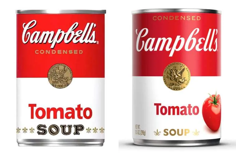
The iconic labels on the flagship product of Campbell Soup Co. are getting their first redesign in five decades.
The famed red-and-white iconography will remain, but the Campbell’s logo is receiving a “modernized logo scripture.” As part of this change, Campbell’s is eliminating the shadow and slightly changing its font, which is based on founder Joseph A. Campbell’s signature.
“The refreshed label still evokes the same sense of comfort, goodness and Americana,” the company said in a statement.


