From Engadget.com….
Judging from the first Windows 11 Insider Preview, Microsoft’s next OS is shaping up to be much more than a mere Windows 10 update. The company is fundamentally shifting the way many aspects of Windows works, with a centered taskbar and redesigned Start menu, among other changes. But it’s still Windows, so at its core it still works like it always has.
There’s the focus on productivity that Microsoft leaned into with Windows 10, along with subtler improvements that makes for a more pleasant user experience. At this point, Windows 11 feels like an OS that will please PC diehards and mainstream users alike.
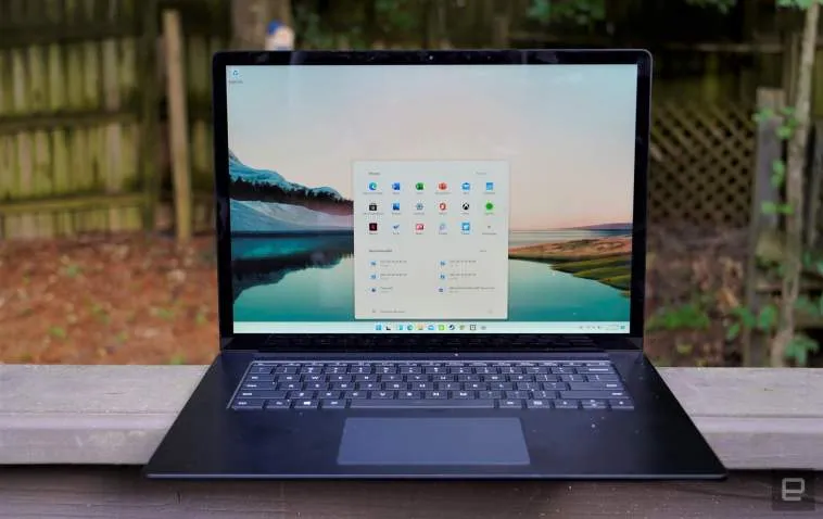
At first glance, the Windows 11 Insider Preview, which started rolling out on Monday, doesn’t look much different from the leaked build we covered a few weeks ago. The centered and icon-filled taskbar still looks distinctly Mac-like; the rounded window corners give off a slightly more polished vibe; and the redesigned Start menu is sure to be controversial. It features pinned app shortcuts up top, recommended files at the bottom, and a link in the top right to see the entire unfiltered Start Menu.
This Start menu is certainly different, but after testing out the leaked build for two weeks, I’ve grown to prefer the changes. I’ve never met anyone who used the Live Tiles in Windows 10’s Start menu, and those were just a distilled remnant from Windows 8’s horrific full-screen Start page. It’s nice to be rid of that legacy, once and for all.


