(Steve Kirsch)
Executive summary
What I found was fascinating is that if you did get COVID, the probability of being hospitalized was identical in the two groups.
My survey results are publicly viewable and all the entries can be verified (I have the contact info for each respondent). Happy to provide to any mainstream media fact checker.
Bottom line: The CDC lied, people died. If you disagree, please post your row-level data survey results.
The results
The results were stunningly self-consistent. If there is a significant bias, I can’t find it.
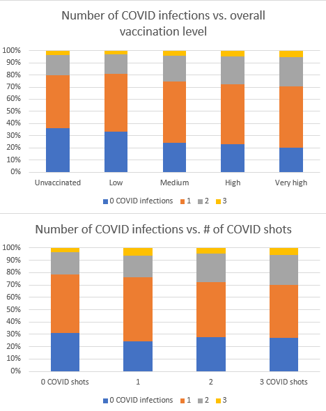
Here are some charts plotted from the pivot tables:

You’ll notice that the unvaccinated have the greatest blue area (0 COVID infections).
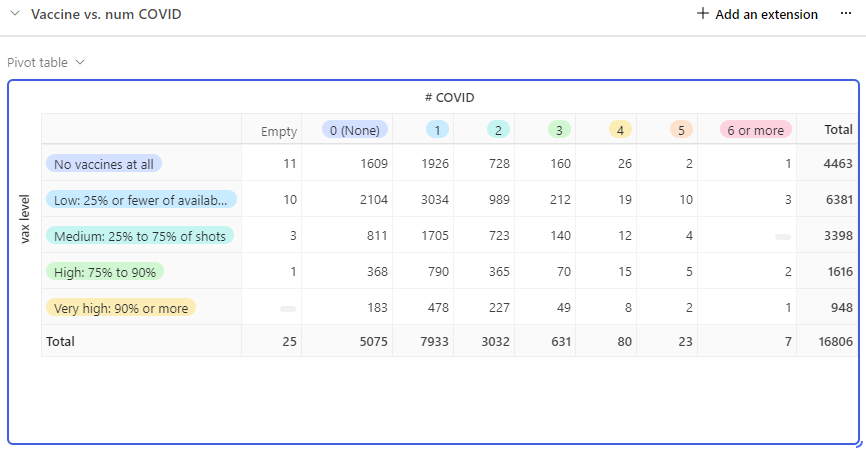
Here’s a snapshot of the numbers:

Let’s drill into the number of 0 COVID infections for the unvaccinated vs.
Let’s compare the “No vaccines at all” vs. the “High” and “Very high” groups. If I choose just Very high, the vaccine looks even worse, so I’m trying to be as accommodating as possible.
The 2×2 matrix looks like this:
[ 11+1609, 4463-(11+1609) ]
[ 1+368+183, 948+1616 – (1+368+183) ]
The bottom line is:
Odds Ratio: 2.0769548394989985Confidence Interval: (1.8565010966269044, 2.323586780075697)Z-Score: 12.766715746271233P-Value: 4.0149631491125137e-39
Something caused the unvaccinated to be 2X less likely to get COVID. I wonder what it is. Something the unvaccinated all have in common. Hmmm….
It is amazing that nobody who believes in the vaccine will do their own survey, isn’t it? Now you know why.
If you got COVID, your risk of hospitalization is exactly the same regardless of your vaccination status.

Here’s how to do the math:
Risk of hospitalization for the unvaxxed: 74/4447 = .0166
Risk of hospitalization for the heavily vaxxed (right two columns, select row for 1 hospitalization): (26+14)/(947+1610)= .0156
These are essentially the same, a tad higher for the unvaccinated (which is a surprise but that’s what the data shows). But since the unvaxxed are 2x less likely to get COVID in the first place, you want to be unvaccinated, no question.
Note: It is amazing to me how the pro-vax people will claim my results are useless, but if it finds some data favorable to the vaccine, that data is legit (and the rest is not). We’ll see what happens here… if they say the survey is legit, they cannot cherry pick the parts they like. All or nothing.
My Twitter surveys were similar
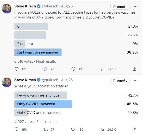
My Twitter followers are nearly 90% COVID unvaccinated. But the questions are directed to vaccinated and unvaccinated followers:

The two surveys below were the most stunning. One is with the unvaccinated, the other is with the vaccinated. What’s stunning is the relative heights of the first two bars relative to the third bar. This is consistent with the Substack survey… The unvaccinated are less likely to have COVID than the vaccinated.
Look at the survey above… the FULLY unvaccinated (unvaccinated for all vaccines) did even better than the COVID unvaccinated below (although the question was a big ambiguous, you have to assume it was read both ways and was a mix of the no COVID and no all vaccine group).
So both the Substack and Twitter surveys were large and the data clearly showed the unvaccinated were better off.

Where is their survey showing I’m wrong?
Fact checker notice
Nobody knew what my objective was; I just asked how many times they had COVID.
Bottom line
In general:


