From HollywoodReporter.com…
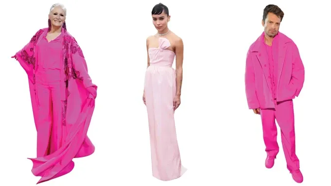
At this year’s Oscars, Zoë Kravitz charmed in a champagne pink gown from Saint Laurent, while at the Met Gala Glenn Close stunned in a neon magenta blouse and trousers topped by an embroidered cape from Valentino. Harry Styles and Lizzo, meanwhile, wore hot pink pants paired with shaggy oversized coats at Coachella. Everywhere one looks this spring, as we emerge from our pandemic doldrums, the world seems to be telling us one thing: Think pink.
It’s hard to know where this recent style obsession with pink originally began, but one could point to Melrose Avenue in 2005. After all, it’s there and then that the now-iconic neon pink wall first appeared, the brainchild of designer Paul Smith, who was looking to distinguish his tony men’s boutique from the gritty, graffitied urban sprawl that surrounded it.
“I remember exclaiming, ‘We need to make the Eiffel Tower!’ ” the designer explained recently in an email. “And by that I meant something that was different and stood out against the skyline.” The color was inspired, in part, by the happy hue that was a favorite of Mexican architect Luis Barragán and the idea that, contrasted against L.A.’s blue sky, it would be an instant traffic-stopper. He was right, of course. And though it debuted a full five years before Instagram appeared, the Paul Smith pink wall was a harbinger of things to come, beckoning a tidal wave of wannabe influencers and selfie-takers looking for the perfect picture.
In the intervening years, pink has increased its chokehold on the zeitgeist, with a particular shade of pale pink becoming ubiquitous. It became the preferred hue of brands ranging from Acne Studios and Glossier, or spaces like West Hollywood’s Alfred Coffee or the restaurant Sketch in London. It’s migrated to runways, to apartment walls, to gadgets (see: iPhone’s rose gold, launched in 2015) and to website pages and marketing materials as far as the eye can see.
The writer Véronique Hyland, in 2016, even affixed it to a generation, dubbing it “millennial pink,” a name that has stuck, for better or worse. It’s an “ironic pink,” she wrote for The Cut at the time. “Pink without the sugary prettiness. It’s a non-color that doesn’t commit, whose semi-ugliness is proof of its sophistication.” That same year, Pantone named a powdery salmon tone, Rose Quartz, as its color of the year.


