

(Steve Kirsch) If you do a simple plot of the absolute number of deaths per day after a vaccine shot is given vs. the number of days that have elapsed since the shot, other than for a brief 21-day period after the shot, the number of deaths per day will always monotonically decline over time in a safe vaccine.
But for the COVID vaccine, it monotonically increases over time for up to 365 days straight.
This happens in every country, after every dose that I have data on! That’s stunning. It’s never supposed to go up unless something huge is happening in the background, and even then, it would be time limited.
A positive slope for 1 year post vaccination is unprecedented. It means the COVID vaccine is killing people. There is no other explanation. Nobody can explain it. Instead, they claim there might be a confounder and that my failure to find a confounder is not proof that no such confounder exists.
The New Zealand data “smoking gun”
And we have other confirmatory signals that the huge number of excess deaths is related to the vaccine from the embalmers where they used to find clots in 15% of their cases, and now it’s in over 90% of their cases.
There is only one explanation that fits these facts: the COVID vaccines are deadly.
This is why the CDC never will show America the Medicare data. Never. The truth has to be hidden from everyone.
And this is why the medical community never asks to see the data.
If they saw the data, doctors would have to admit they were wrong.
The same effect has been observed in the four other countries I have this data on: New Zealand, UK, Israel, and the Maldives.
What more do you need to know?
Introduction
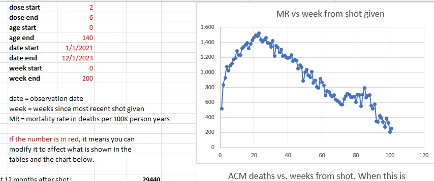
Note that Medicare is mostly older people and the average mortality rate is around 4% per year.
These are all people who got vaccinated in 2021 and it looks at the number of deaths per day since the first shot of the vaccine was given in that year (if more than one shot was given). The x-axis is the days since the shot was given. So it is relative to the day of the shot.
So the age distribution of the cohort is determined by the age mix of the people who got the shot in 2021.
Over a one year period, the age distribution will change by a small amount since people die. So the fixed size cohort (the number of people who got the shot in 2021) gets smaller over time.
But the bottom line is that for a safe vaccine, the line always slopes downward after a brief upward slope for the death rate to get to baseline caused by the temporal healthy vaccinee effect (tHVE). This effect lasts up to 21 days or so. So starting on Day 28, the slope should always be going downwards.
The downward slope of the charts is a fundamental property of death: deaths per day are simply proportional to the number of people who are alive. The mix doesn’t matter. It always slopes down.
So if you have an overall 4% death rate, the number of people dying per day should be 4% lower than at the start of the period. In summary, the slope of the line will be set by the average age of the cohort who got the shot.
There are secondary effects. The two biggest are:
- The age mix of the remaining cohort changes over time as people die off,
- People are a year older at the end of the observation period and thus die at a slightly higher rate than at the start. For example, if you have 100 year olds dying at 43% per year, by the end of the year they are dying at 50% per year, a 16% relative increase and a 7% absolute increase in death rate. There are simply a lot fewer people available to die and it isn’t overcome by the increase in the death rate which works in the opposite direction. So this effect results in the negative slope being slightly less than what is predicted from the primary effect, but it is still negative. The only time it would approach a 0 slope is if the death percentage per annum is equal to the gain per annum from the fact people are a year older. If there was going to be a crossover, we’d see it near 100 years old (since beyond that, there are too few people to affect the curve). 43% > > 16%. That tells you everything you need to know. The slope is always negative. We see that in the Medicare data.
In practice, these secondary effects never change the direction of the slope: it is ALWAYS negative, i.e., on average, fewer people die every day.
This is fundamental because there are simply fewer people left to die and the change in the death rate caused by aging is always a fraction of the death rate itself.
This is why, when we look at all age stratified curves just to make sure, it always slopes down. In general, the older the cohort, the more the downward slope.
The effect of background extinction events
Conversely, if the vaccine is given evenly over time, background effects will all be averaged out and just shift the line upward, but will not affect the downward slope.
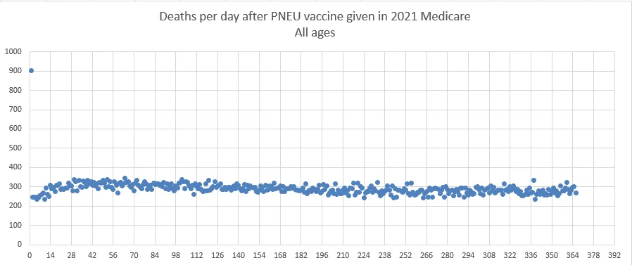
Pneumococcal vaccine curve (Medicare 2021 all ages)
The pneu vax is given throughout 2021. Follow-up is 1 year from shot date for each person. Age stratifying the results shows the same shape for both vaccines. So 65-75, 75-85, and 85 and up is same shape, just different height and more negative slope for the older cohorts. There are fewer total people who got this shot (it is not an annual shot), so that is why the absolute death numbers are smaller. But 300 deaths per day is plenty to establish a signal with very little noise as you can see from the chart.
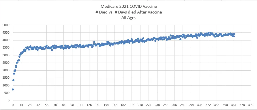
COVID vaccine curve (Medicare 2021 all ages)
This is not a small subset either. For example, as of December 12, 2023, approximately 79.8% of Medicare beneficiaries have received at least one dose of a COVID-19 vaccine. This figure comes from the Centers for Medicare & Medicaid Services (CMS).
The New Zealand version of the Medicare chart

And here’s the chart for Dose 2

Could it be COVID? COVID deaths were on the order of 10 deaths per day in the full 5M population. In the graphs above, these are ~1M person cohorts, so any COVID effects would be on the order of 2 deaths per day which is 14 deaths a week.
But the curves for deaths after Dose 1 are all before COVID deaths started happening so the slope of Dose 1 above cannot be explained at all by COVID. Also the shape of the COVID death curve is not monotonically increasing, but relatively flat.

Analysis
The pneumococcal vaccine slopes downward exactly as expected from 308 average down to 288, a decrease of 6.5% over one year.
The COVID vaccine monotonically slopes upward from an average 3492 deaths per day after the shot to 4365 deaths per day, an increase of 25% over one year.
This is stunning. It is unprecedented.
The COVID vaccine is supposed to slope down like every safe vaccine as noted in the introduction. It’s a law of nature. Monotonically sloping upward over a one year period has never been seen before. It is inexplicable. There is no background event that could cause this to happen. Most of the COVID shots for the elderly were given over a concentrated period of time (in the first 3 months of the year).