
(Steve Kirsch)
Nota Bene
This may well be the most important article I’ll write in 2023.
In this article, I publicly reveal record-level vax-death data from the “gold standard” Medicare database that proves that:
- The vaccines are making it more likely that the elderly will die prematurely, not less likely
- The risk of death remains elevated for an unknown period of time after you get the shot (we didn’t see it return to normal)
- The CDC lied to the American people about the safety of these vaccines. They had access to this data the entire time and kept it hidden and said nothing.
If there is one article for you to share with your social network, this is the one.
Executive summary
But apparently there is one whistleblower who is interested in data transparency.
Last night, I got a USB drive in my mailbox with the Medicare data that links deaths and vaccination dates. Finally! This is the data that nobody wants to talk or even ask about.
I was able to authenticate the data by matching it with records I already had. And the analysis that I did on the data I received matches up with other analyses I have received previously.
The nice thing about this Medicare data is that nobody can claim that it is “unreliable.” Medicare is the unassailable “gold-standard” database. It’s the database that the CDC never wants us to see for some reason. They never even mention it. They pretend it doesn’t exist. So you know it is important.
Do you want to know what it shows?
It shows that these shots increase your risk of dying and once you get shot, your risk of dying remains elevated for an unknown amount of time. And that’s in the very population it is supposed to help the most!
Now you know why the CDC, which has always had access to the Medicare records, has never made them publicly available for anyone to analyze to prove that the vaccines are safe. Because the records show the opposite. That’s why they keep the data hidden from view and it’s why they NEVER talk about it.
Today, in this article, you will finally get to see what nobody outside the HHS has ever seen before: the “gold standard” Medicare records, i.e., the truth. You can analyze it yourself.

You’ll soon see for yourself why the CDC will never release this data and why the mainstream press is NEVER EVER going to ask to see the data: because it would reveal they lied to people and killed over 500,000 Americans by recommending they take an unsafe “vaccine.”
The bottom line is this:
After all, if the data supported their narrative, they’d be tripping all over themselves to release the data. When it doesn’t support the narrative, they simply never talk about it and pretend it doesn’t exist and tell the press never to ask about it.
So you already know how this is going to end. Very badly. For Biden, the CDC, the FDA, the mainstream medical community, the mainstream press, and Congress. They all will have egg on their face because they never asked to see the data.
The “misinformation spreaders” will have been proven right with the government’s own “gold standard” database. It’s payback time.
Acknowledgements
Professor Norman Fenton had a look as well and he didn’t find anything amiss either.
This doesn’t mean there aren’t any flaws, but it just means that there aren’t any obvious flaws. If you find a mistake, let me know in the comments.
Why this article is so important
If nobody can explain how the “slope goes the wrong way,” then this should be GAME OVER for the vaccination program because we are using their own “gold standard” database to prove that the vaccines are not safe and that they lied to us.
Unless I made a serious error, there is no rock big enough for them to hide under on this one. No excuses. No attacks. It’s basically bulletproof. The results simply cannot be explained if the vaccines are safe. And the numbers are huge. You don’t need a peer reviewed study on this one.
The Medicare data that I received
It’s in Excel, there are over 114,000 records, and you can download it here.
While I would have liked to receive the merge of all death records and vaccination records of everyone in the US, the data I did receive, when properly analyzed, is sufficient to prove the point that the vaccines are increasing your risk of death.
LIMITATIONS
Be sure to read the About tab for caveats about the data. It will help if you read and understand this article before you look at the records.
MEDICARE DATA NOTA BENE
Note that the scatter plots below were produced from a much larger set of Medicare records than the ones you can download. The plots from the records I received are included in the Excel spreadsheet and are consistent with the plots in this article which are the higher quality plots (and which contain dose 2 and 3 plots).
Overview of how to analyze the Medicare records
Because we only have vax-death records of people who have died (rather than the full set of records that any truly honest government would supply), we have to analyze the data in a certain way to understand what is going on.
This is a new way to look at the data so let me give you the bird’s eye overview first.
The main thing is that in Jan 2021 we have a double whammy of death: from COVID and seasonality (older people die more in winter).

So if the vaccine does absolutely nothing, we’ll see the slope of the histogram of the deaths per day curve go dramatically down in the first quarter as COVID and seasonality effects diminish. Then it will flatline for a time until seasonality picks up again in winter or there is another big COVID outbreak. The drop could be as much as 40% from the peak value (e.g., from 536 to 324) in Figure 0.
If the vaccine is PERFECT, we’ll see the same slope go down, but not as much because we’ll just see seasonality effects going down (since nobody is dying from COVID). It will then remain perfectly flat until it picks up again in winter. See Figure 1 below for what the “deaths per week” curve should look like for a perfect vaccine.
The main point is this: if the vaccine isn’t causing harm, the slope will go down and remain flat.
What I will be doing below is calculating the days until death from shot #1 if and only if shot #1 was given in Q1 of 2021. So that histogram should look very similar to Figure 1. It’s going to be smoothed somewhat since the shot was given over a quarter (rather than on a single day), but since most of the vaccine in Q1 was delivered in the first half of January, the curve will be pretty similar to Figure 1, but it will start to flatline a couple of weeks sooner.
Once you understand these concepts, you are ready for the details.
For people in Medicare, there is a strong seasonality effect on the death rate
For the elderly, there is a strong seasonality of deaths. They are high in the winter and low in the summer. The difference between peaks and troughs is around 20%. This data is from the CDC for ages 65-84:

What this means is if you got the shot in Q1 of 2021, and you look at the days until death, if the vaccines are safe, you should find that it will go lower in time and then turn upwards.
But what we find is the opposite.
The control group for 2021
Figure 2 shows the deaths by week in 2021 for all states ages 65-84. Note that the rates drop for the first 11 weeks and stabilize.
In 2021, there is a steeper drop than normal because of COVID adding to the drop:

The vaccine program was initiated on Dec 14, 2020, and peaked in the third week of Jan 2021 for people in this age group:

The charts show the slope goes up instead of down
As we noted in the previous section, if the first shot is given in Q1, the number of days after the shot until you die should go down for at least 9 weeks and then stabilize for the next 15 weeks per the seasonality described in the previous section. So a safe vaccine would look like Figure 2
But it doesn’t. It goes up! That’s the problem.

Similarly, if we restrict our analysis to the first shot given in Q2 (most of which would have been given in April), we see the same problem. The slope should be flat for around the first 15 weeks after the shot is given (we are starting in a flat period (week 13) and we have about 15 weeks of flat deaths after that. Yet the slope is going up when it is supposed to be flat.

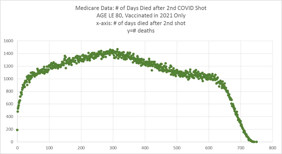
The same wrong slope happens with shot #2
The same problem happens with the second shot. About 75% of the people in Medicare were injected with shot #2 prior to April 15, 2021.
Here’s what the shot #2 injection schedule looked like in Connecticut:

Therefore, we should have seen a downward slope in the beginning and we are seeing the opposite again.
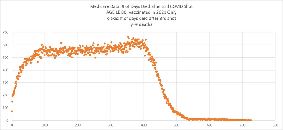
The same wrong slope happens with shot #3 too
Most people in Medicare got shot #3 in October, 2021. So we should see an upward trend for about 60 days (due to seasonality and another COVID wave), and then it should fall dramatically.
It doesn’t. It remains flat. That’s problematic. It suggests that if you lived until shot #3, it will still increase your risk of dying, just not as much as the earlier shots.
This chart would have been more useful had the Dose 3 vax window been narrowly restricted. Stay tuned…
This is the most damaging chart I’ve seen

This is a chart of people who just got two shots and no more. At first, I dismissed it because if you got 3 or more shots, you’d leave the group so the flat part starting at day 400 isn’t a valid steady state number because the size of the cohort changes due to the “no other shots” criteria.
But then I did a calculation using the Connecticut data and found that when there were 23,259 deaths from Dose #2, there were only 10,557 deaths from Doses #3 onwards. So this suggests to me that fewer than half the people in Medicare opted for the jabs.
Then I confirmed in USA FACTS that fewer than half the people who got shot #2 got any of the boosters (68% vs. 33%).
So if we simply take our 200 deaths per day flatline number from the chart above and adjust it for the people who left the cohort (i.e., double it to 400 steady state deaths per day), we can see that the first 200 days, we had a 50% increase in the rate of death (600 per day) vs. the 400 per day rate after 1 year (which itself might be elevated from normal).
This is a complete disaster no matter how you look at it.
The good news here is that it shows if you stop the shots, it appears your risk lowers after a year.
As you can see from this chart, if you keep on with the shots, as half the people did, your risk of death remains elevated!

Shot #4 elevates your risk as well, for the few that took it
People in Medicare got up to 7 total shots. That’s really stunning.
For example, in Connecticut, the numbers are: 31170, 23259, 8902, 1428, 217, 9, 1. So only 1 person got a 7th shot.
Here’s the graph for people who got Shot #4:

So people got shot #4 in 2022 which is why the graph falls quickly after day 200 (you simply run out of time to die). But you can see the same elevation in risk happening after this shot as well.
Death curve for the unvaccinated
James Surowiecki said was confused by this article because I didn’t include the unvaccinated.
I purposely didn’t include that chart because it would be confusing.
But if James was confused because I didn’t include it, I’ll include it with a big caveat.
The problem with the Medicare data is that the unvaccinated are a mix of people with vaccination and no vaccination so it is not pure. This is because Medicare patients went to a pharmacy to get their free vax and it wasn’t recorded in the Medicare records. This is why half the Medicare records don’t have any vax info at all. For Connecticut for example, there were 57,297 records of people in Medicare who died since Dec 14, 2020 and 26,092 had no vaccine records.
Also, people migrate from the unvaccinated group to the vaccinated group at an unknown rate (even Medicare doesn’t know the rate) which makes it problematic to use. That’s why I didn’t include it.