


Executive summary
The reality is that the curves are not horizontally shifted versions of each other. That means the intervention had an unintended all-cause mortality effect when COVID wasn’t present (i.e., to kill people).
This is why they aren’t showing us the raw data.
Because they don’t want anyone to know the truth.
Introduction
Since the vaccines aren’t given randomly over time, but are concentrated in certain quarters, the easiest way to analyze the days till death results is to restrict the sample to those people who got vax #N in a specific range of time.
The results
- The curves were dose dependent (shape varied based on dose number)
- The curves didn’t match either the baseline reference or the 2021 reference.
- The curves don’t even match themselves; with one week qualifying windows, the curves should just be horizontally “shifted” versions of each other (easiest is to line up the drop off at the end when comparing).
This means the vaccines are not saving lives. They are killing people.
The reference data: the key to understanding the Medicare curves
In order for you to understand what is going on, you first need to understand what to expect.
That’s really simple. If the shot is given in Q1 of 2021, the death curve after the shot should look like the background death curve since the shots are perfectly safe. They shouldn’t kill you.
There are 3 possibilities here:
- If the shots significantly reduce the risk of COVID deaths by a factor of 10X like the CDC claims, then the “deaths vs. days after shot” curve should look almost exactly like the “before COVID” death curve, i.e., the reference curve in 2015-20109. This is because everyone getting the shot now has the normal average risk profile for death. There will be no “humps” when COVID deaths are high.
- If the shots do nothing to reduce mortality, then the “deaths vs. days after shot” curve should look exactly like the overall underlying mortality curve for that year and each graph will be just a shifted version of the other graphs.
- If the shots kill people, then the “deaths vs. days after shot” curve will not fit either of the above cases (or anything in between).
We don’t consider the possibility that the shots lower all-cause mortality since there is no plausible mechanism of action for that, nobody has claimed it, none of the clinical trials showed a measurable decrease in ACM, and the funeral business increased after the shots as well as the % of people dying with odd clots.
So here are the reference curves…
Baseline reference: Here’s 2015-2019 for 64 and older data from the CDC website; it peaks at an annual average of 92K people per week and the mid-year trough (weeks 22 – 38) is around 73K people/week):
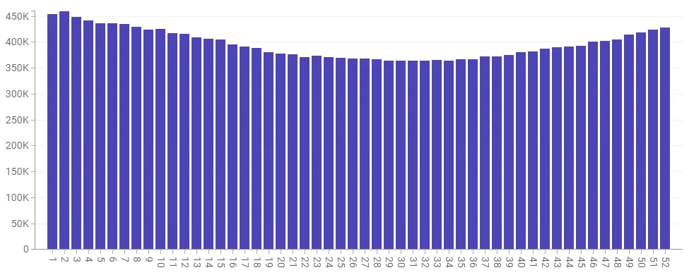
5 years 2015-2019 weekly death in the US for those 65 and older from CDC data. Screenshot taken from the CDC website.
Here’s the same data for the US, but only for 2020. The extra peaks can be reasonably attributed to COVID (but mostly to our horrible hospital treatment protocols (instead of advising early treatments developed by many independent physicians at the time). That’s because there was no vaccine at the time so nobody could die from the shot since it wasn’t available. Note we didn’t see the normal decline in January… the rates stayed elevated.
2020 deaths by week 65 and older
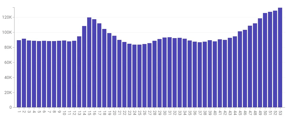
2021 reference: For 2021 we’re coming off a huge peak in Jan, but we never see the lows we should be seeing. And there is a big hump in Q3 which starts around week 30 (July 28) and ends around week 41 (Oct 14). Is the bump COVID? Or vaccine deaths? Or a combo? One thing is for sure; two-thirds of the country had at least one dose by that time, so if the vaccine really worked, we’d expect to see at most a 10K COVID death spike.
2021: Weekly deaths vs. week number for 65 and older. If the vax does nothing the shots should have a profile look like a shifted version of this (depending on when the shot was given)
And just to prove that the CDC data for those 65 and over matches the Medicare data, here’s the data from Medicare:
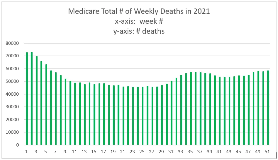
This is directly pulled from Medicare for 2021. Note that it matches our CDC graph for those 65 and older. This is totally expected.
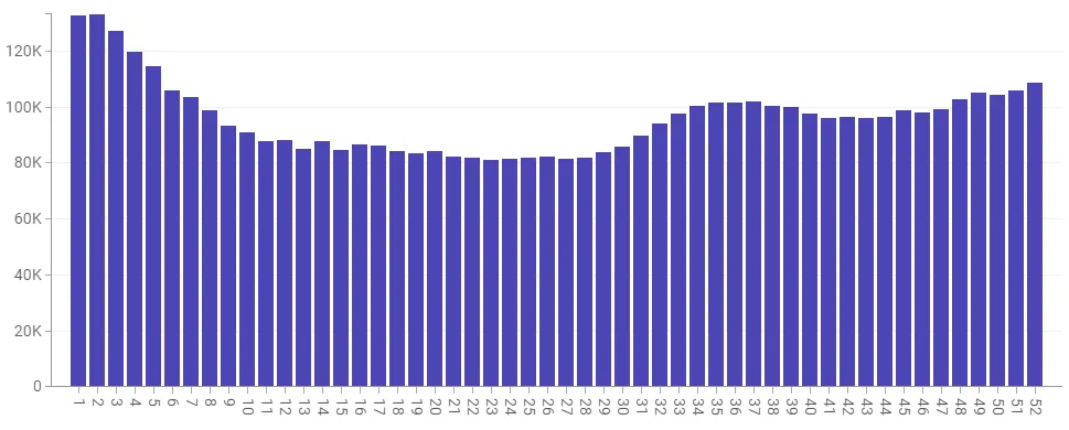
For 2022, we still aren’t back to normal as there was a huge spike in Q1 of 2022, but after that, things are looking more normal, but the trough is still elevated by around 10% overall from our 5-year reference which would be consistent with a large fraction of the population being vaccine injured and more likely to die. Note: No COVID spikes. Week 25 is 85,785 (2022) vs. 73,977 (5 year reference) which is a
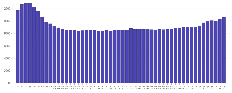
2022: Weekly deaths vs. week number for 65 and older. The important thing here is that the flat portion here is comparable to the flat portion in 2021. So the dips in 2021 should be comparable to the dips in 2022. If they are lower in 2022, it means the shot killed people in 2021. If the dips are higher in 2022, it means the shots are killing people over the long term. Note that the 2022 peak is about the same height as it was in early 2021.
The Medicare data
This is Medicare data for those vaccinated during the quarter indicated and died. The graph x axis is how many days until they died from their vaccination date as specified (and not their “last” vaccination date which would give distorted results).